
A One-Bedroom in Chicago’s Loop Runs $2,700. Fifteen Minutes Away in Avalon Park, It’s $995. Nobody Markets the Second Number
We may earn money or products from the companies mentioned in this post. This means if you click on the link and purchase the item, I will receive a small commission at no extra cost to you ... you're just helping re-supply our family's travel fund.
Chicago’s citywide average rent sits around $2,000 to $2,500 depending on which data source you check, a figure that gets repeated constantly in national cost-of-living comparisons. What almost never gets repeated is that a huge swath of the city, mostly on the South and Southwest Sides, rents for roughly half that citywide average, with one-bedrooms in neighborhoods like Avalon Park, Chatham, and Englewood running $900 to $1,100 a month according to multiple 2025 and 2026 rental market analyses.
The Neighborhoods Nobody Puts on a Moving Vlog

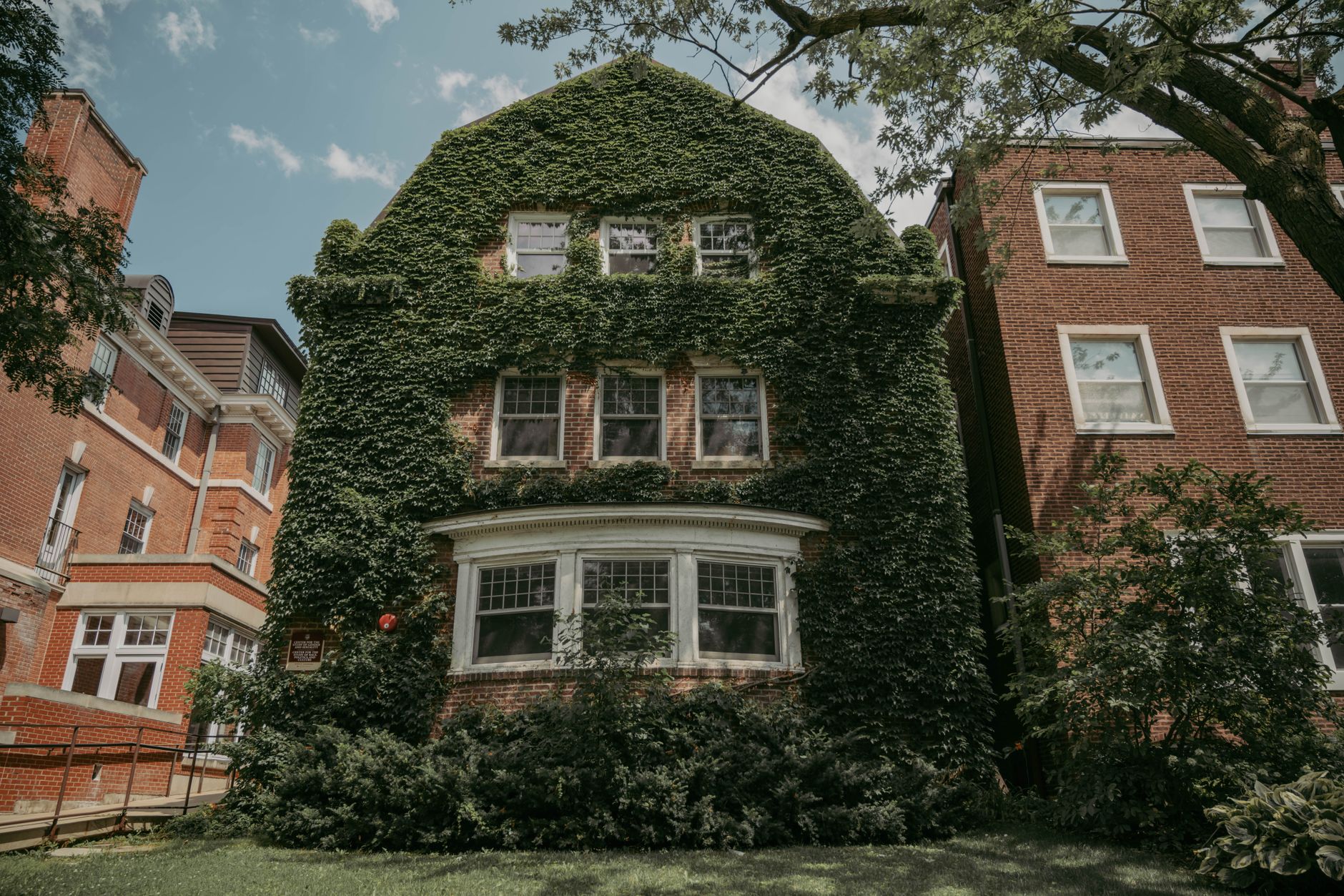
Zumper’s rental data for late 2025 and early 2026 put Chatham at a median rent of $1,185, roughly 41 percent below the citywide median of $2,064. Chicago Lawn and Avalon Park followed closely, both around 35 percent below the city median. These are not fringe, unlivable pockets; they’re established residential neighborhoods with historic housing stock, including Chatham’s blocks of well-built brick bungalows dating to the mid-20th century, when it was a solidly middle-class area.
The Rent Gap by the Numbers
- Chatham: median rent around $1,185, roughly 41 percent below the citywide median
- Chicago Lawn: around $1,295, about 35 percent below the median
- Avalon Park: around $1,300, tied for 35 percent below the median, with a notably peaceful, residential atmosphere
- Englewood: some of the lowest one-bedroom rents in the city, around $860 to $1,077 depending on the data source
- For comparison, a one-bedroom in the West Loop or Wicker Park regularly runs $2,700 to $2,950
Why These Areas Stay Under the Radar

Part of the answer is straightforward disinvestment history. Many South and Southwest Side neighborhoods lost population and retail investment during the second half of the 20th century, following patterns of industrial decline and, in some cases, discriminatory lending practices that shaped Chicago’s development for generations. That history left behind a housing stock that is often structurally sound and architecturally distinct but surrounded by fewer amenities, restaurants, and retail than the North Side neighborhoods that get featured in relocation content.
There’s also a marketing gap. Apartment-search platforms and moving content creators overwhelmingly focus on neighborhoods like Logan Square, Wicker Park, and Lincoln Park because that’s where the advertiser demand and content engagement already exists. Nobody makes a viral apartment tour of a $995 one-bedroom in Avalon Park, even though the actual math is more useful to more renters than another tour of a $2,900 West Loop high-rise.
What You Trade for the Lower Rent
- Longer commutes into the Loop, though several South Side neighborhoods, including Woodlawn and Bridgeport, sit on Metra or CTA lines with direct downtown access
- Fewer walkable retail and restaurant corridors compared to North Side neighborhoods, though this is changing in areas like Bridgeport and Pullman
- A different social fabric, often more families and long-term residents, less transient student and young-professional turnover
- Home values in these neighborhoods also run far lower, with some South Side median list prices under $200,000 against a citywide average near $340,000
The City Chicago Doesn’t Advertise to Newcomers
Pullman, once a planned company town built in the 1880s for railcar workers and now a National Monument, represents maybe the clearest example of this gap: a historically significant, architecturally cohesive neighborhood with rents around $1,028 a month, virtually unknown to anyone outside Chicago and largely overlooked by people inside it too. The city’s affordability crisis narrative is accurate for the neighborhoods that get photographed. It is a much less accurate description of the city as a whole.
The History Behind Why These Neighborhoods Got Overlooked
Much of the disparity in attention between Chicago’s North and South Sides traces back to mid-20th century redlining maps, which systematically marked South and West Side neighborhoods as high-risk for mortgage lending regardless of the actual condition of the housing stock or the financial stability of the residents living there. Those maps shaped decades of private investment decisions and public infrastructure spending, and their effects persisted long after the formal practice of redlining was outlawed, showing up today in which neighborhoods have well-maintained retail corridors and which ones don’t, independent of the actual quality of the housing itself.
That history matters for anyone evaluating these neighborhoods as a place to actually live, not just as a line item in a rent comparison. The housing stock in areas like Chatham and Pullman is often structurally excellent, built during a period of skilled craftsmanship that produced genuinely well-constructed brick homes. What these neighborhoods lack isn’t housing quality, it’s decades of retail and commercial investment that neighborhoods further north received instead, a gap that rent comparisons alone don’t fully capture.
Chicago’s rent map is, in a real sense, a map of the city’s entire twentieth-century history, laid out in dollar figures anyone can look up in a few minutes. The neighborhoods that get featured in relocation content are overwhelmingly the ones that were allowed to invest and grow across decades. The ones left off are, disproportionately, the ones that weren’t given the same chance. Knowing that history doesn’t change the rent numbers, but it does change how those numbers ought to be read by anyone actually house-hunting there.
Anyone using an online rent comparison tool to house-hunt in Chicago should cross-reference the numbers against a map of the redlining-era lending assessments, since the correlation between historically excluded neighborhoods and today’s lowest rents is close enough to be treated as a planning tool rather than a coincidence.
Commute times are the one tradeoff that rent comparisons alone don’t capture, since several of the most affordable South Side neighborhoods sit thirty to forty-five minutes from downtown by public transit, a factor that matters enormously for anyone weighing a move based on rent savings alone without accounting for the added time cost of a longer daily commute.
Local aldermen representing South Side wards have pushed in recent years for targeted commercial corridor grants aimed at closing some of that historic investment gap, with mixed results so far, since attracting new retail to a neighborhood requires more than available storefronts and willing landlords, it requires the kind of consistent foot traffic and disposable income that decades of underinvestment made harder to rebuild quickly.