Airports Make You Walk Past Every Store on Purpose. Some of the Other Bad Parts Are Just Nobody Fixing Them.
We may earn money or products from the companies mentioned in this post. This means if you click on the link and purchase the item, I will receive a small commission at no extra cost to you ... you're just helping re-supply our family's travel fund.
Airport terminals are among the most deliberately engineered commercial spaces most people encounter regularly, and a surprising number of the design choices that shape a traveler’s path through one, where security is located relative to shops, how gates are numbered, why the walk to baggage claim always seems to run through duty-free, are the result of specific, well-documented commercial strategy rather than accident. At the same time, plenty of what makes airports genuinely miserable, confusing signage, inadequate seating, chronically broken moving walkways, has nothing to do with revenue optimization at all. It’s simply bad design that nobody with the budget or authority has prioritized fixing.
The Security-to-Gate Walk Is a Retail Corridor by Design
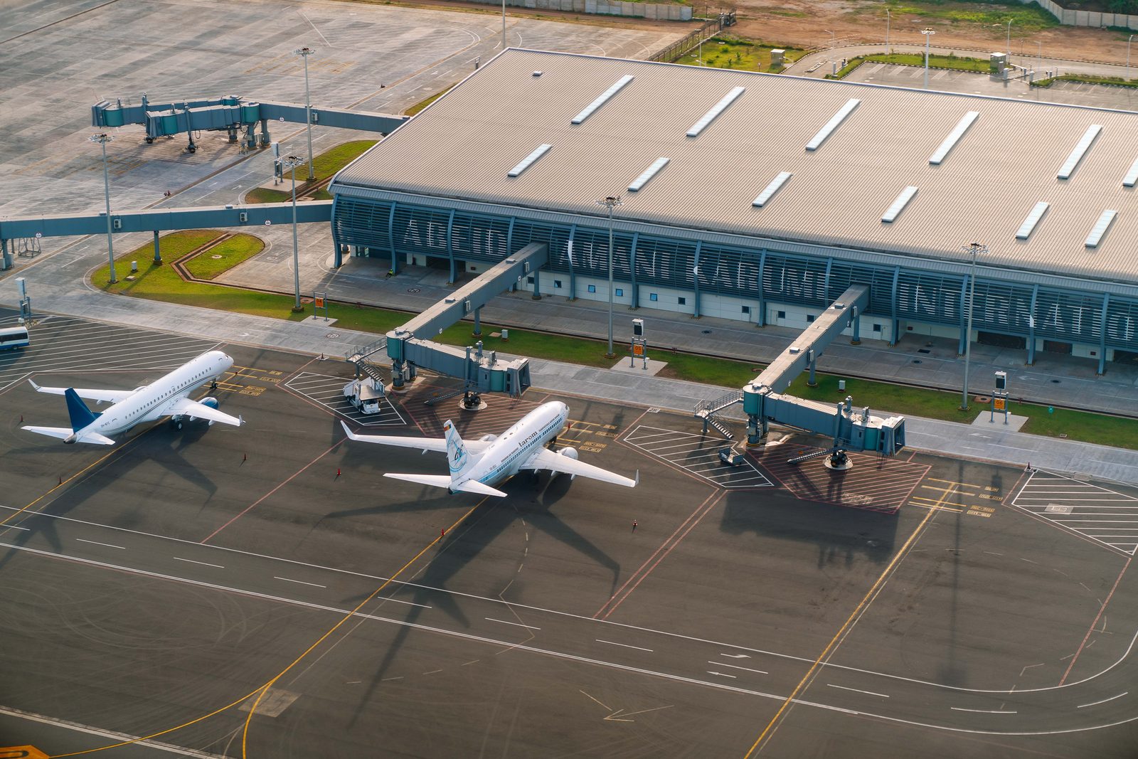
Modern airport terminals are typically designed with security checkpoints positioned to funnel every single passenger through a retail and dining corridor before reaching their gate, a layout strategy airport architecture and retail consultants openly describe as maximizing what’s called “dwell time,” the period after security clearance and before boarding when a captive, bored, often anxious traveler is most likely to spend money. Airports increasingly generate a substantial share of total revenue from these non-aeronautical sources, meaning retail rent and concession sales rather than airline landing fees, which gives airport operators significant financial incentive to route foot traffic through as much retail frontage as physically possible before reaching any given gate.
Gate Numbering and Terminal Layout Aren’t Always About Efficiency
The seemingly illogical gate numbering schemes that frustrate travelers at airports like Chicago O’Hare or Dallas Fort Worth often trace back less to poor planning than to decades of piecemeal terminal expansion, where new concourses were bolted onto existing layouts as airlines and passenger volumes grew, rather than the entire airport being redesigned from scratch with a unified numbering logic. This is a genuine example of bad design that isn’t a deliberate revenue strategy at all, it’s simply the accumulated cost of expanding infrastructure incrementally over 40 or 50 years rather than rebuilding it wholesale, and it’s a problem that persists specifically because a full terminal renumbering and reconfiguration would be enormously expensive and disruptive relative to the inconvenience it would fix.
Seating Scarcity Near Gates Is Genuinely Deliberate in Some Terminals
The chronic shortage of free seating near gates in many terminals, particularly ones built or renovated after 2010, has been directly attributed by airport design critics to a deliberate strategy of pushing travelers toward paid seating areas in airport lounges or toward restaurant and cafe seating that requires a purchase, rather than simply being an oversight. Some airports have responded to public criticism of this trend by adding more free seating in recent renovations, but the underlying incentive, every square foot of prime terminal real estate generates more revenue as paid seating or retail than as free public seating, remains structurally unchanged, meaning the improvement tends to be incremental and market-specific rather than an industry-wide correction.
- Security-to-gate retail corridors are deliberately designed to maximize “dwell time” spending
- Confusing gate numbering often results from decades of piecemeal expansion, not intentional design
- Free seating scarcity near gates is sometimes a deliberate push toward paid lounge or restaurant seating
- Chronically broken moving walkways and escalators reflect maintenance budget prioritization, not strategy
The Genuinely Broken Stuff Is Usually a Budget Problem
Chronically out-of-service moving walkways, poorly maintained restrooms, and confusing wayfinding signage in older terminals generally trace back to a much less strategic explanation: airport capital budgets are frequently stretched thin across competing priorities, runway maintenance, security infrastructure, and terminal modernization projects that can take years to fund and complete, meaning cosmetic and convenience-related fixes often sit lower on the priority list than they would in a purely traveler-experience-optimized world. Airports that have invested heavily in recent full-terminal renovations, such as Salt Lake City International or the newer terminals at LaGuardia, demonstrate that these problems are entirely solvable with sufficient capital investment, which underscores that most of the ongoing frustration travelers experience at older terminals is a funding and prioritization issue rather than an unsolvable design constraint.
Knowing the Difference Changes How You Experience the Airport
Understanding which frustrations are deliberate monetization strategy versus which are simply unresolved maintenance and legacy design debt gives travelers a genuinely useful mental model for navigating any airport: the retail gauntlet between security and your gate is not an accident and can be skipped by knowing your gate number in advance and walking directly there, while chronic infrastructure annoyances like broken walkways or confusing signage are unlikely to be a strategic choice worth getting personally offended by, since they usually reflect an airport authority’s budget constraints rather than any intent to make the traveler’s day worse.
Newer Airports Are Starting to Reverse Some of These Patterns
Several recently built or renovated American airport terminals have begun deliberately reversing some of the more traveler-hostile design patterns that defined airport construction through the 1990s and 2000s, adding more free seating with charging outlets, improving natural light and wayfinding signage, and in some cases explicitly marketing their terminal design as more traveler-friendly as a competitive differentiator against older, more retail-optimized terminals nearby. Airport authorities have started to recognize that a terminal’s reputation for being pleasant or miserable to pass through can genuinely influence which connecting hub a traveler prefers when booking a flight with a layover, giving airports at least some competitive incentive to invest in traveler experience beyond pure retail revenue optimization.
Whether this trend continues at scale likely depends on how airport revenue models evolve over the next decade, since retail and concession income remains a genuinely important funding source for airport operations and infrastructure investment industry-wide. For now, the most traveler-friendly terminals tend to be the newest ones, built with enough capital investment to balance retail revenue goals against genuine comfort improvements, while many of the country’s oldest, busiest hub airports continue operating on layouts and priorities largely unchanged since the era when dwell-time retail optimization was the dominant design philosophy.
Frequent flyers who study these patterns closely often develop specific personal strategies for navigating any given airport more efficiently, downloading terminal maps in advance, knowing exactly which gate area has reliable free seating, and timing their walk to account for the retail corridor rather than being surprised by it each time. That kind of accumulated travel literacy, while never officially taught anywhere, has become an increasingly common body of informal knowledge shared through travel forums and frequent flyer communities specifically because so much of an airport’s design remains genuinely opaque to a first-time or infrequent traveler passing through it.